SCNT is a fragrance-forward, monthly perfume subscription. Members choose from 400+ niche and independent scents and receive a new one delivered every month. We redesigned the full customer journey from the ground up: a quiz-led entry point, a curation-first homepage, collections with deep filtering, and product pages built for confident discovery.
2026
Fragrance subscription is a crowded space. Most platforms are built around catalogue size, not the experience of discovery — and the design tends to reflect that. SCNT wanted something different. A platform built around fragrance discovery, not just delivery. The challenge: make a catalogue of 400+ scents feel easy to navigate. Make the subscription model feel worth it before someone even signs up. And build a brand identity that stands apart from the clichés dominating the category. The goal was to increase conversions and grow the member base by making the path from curious first-time visitor to paying subscriber as clear and frictionless as possible.
What we designed.
We started by mapping the full customer journey — from first visit through homepage, quiz, browsing, product page, and cart — and finding where the experience was losing people. We restructured around guidance first, commerce second. Our goal was to increase time on site and scroll depth by making every step of the journey genuinely useful, so in the end we convert more of that engagement into subscriptions.
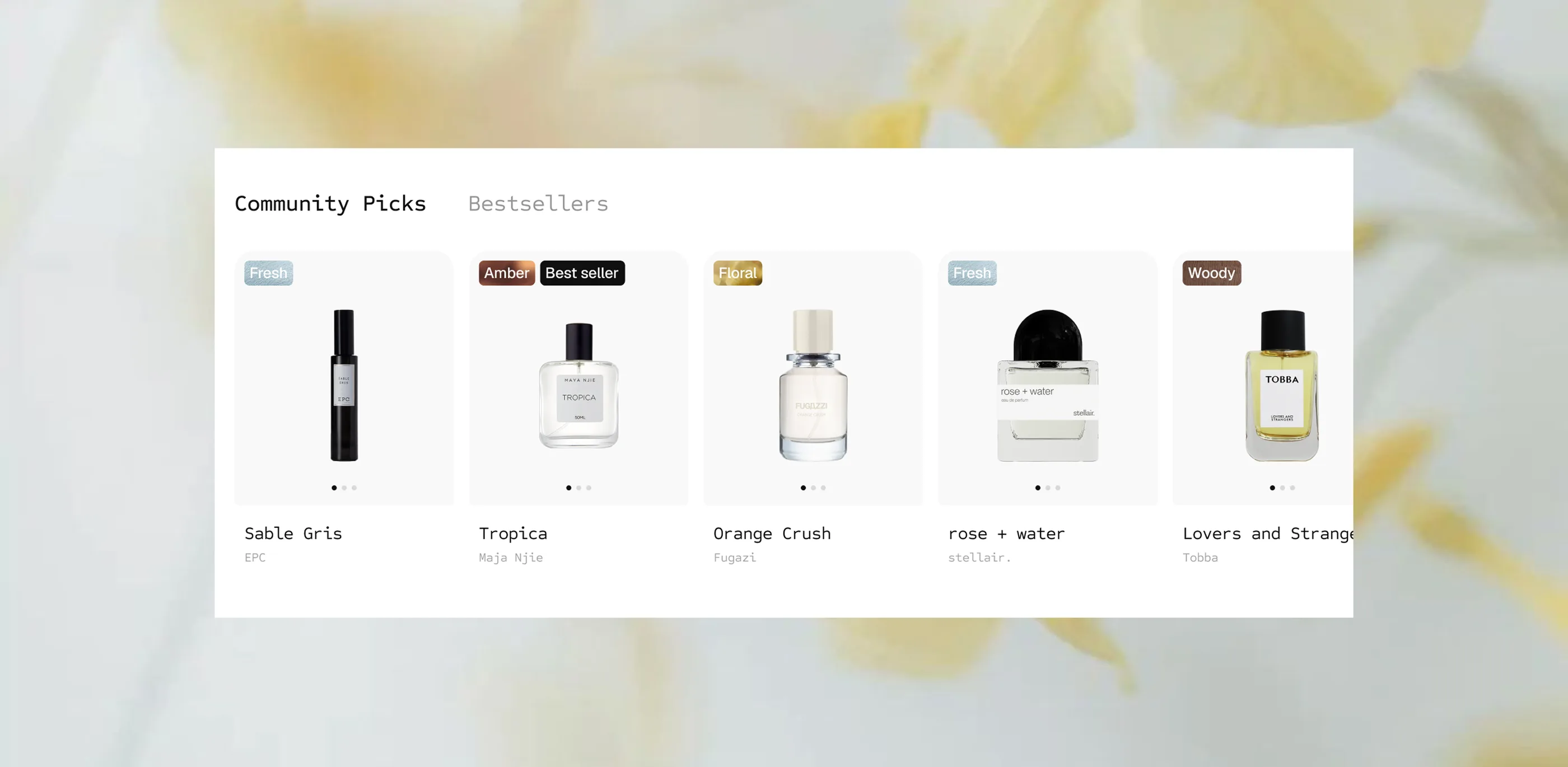
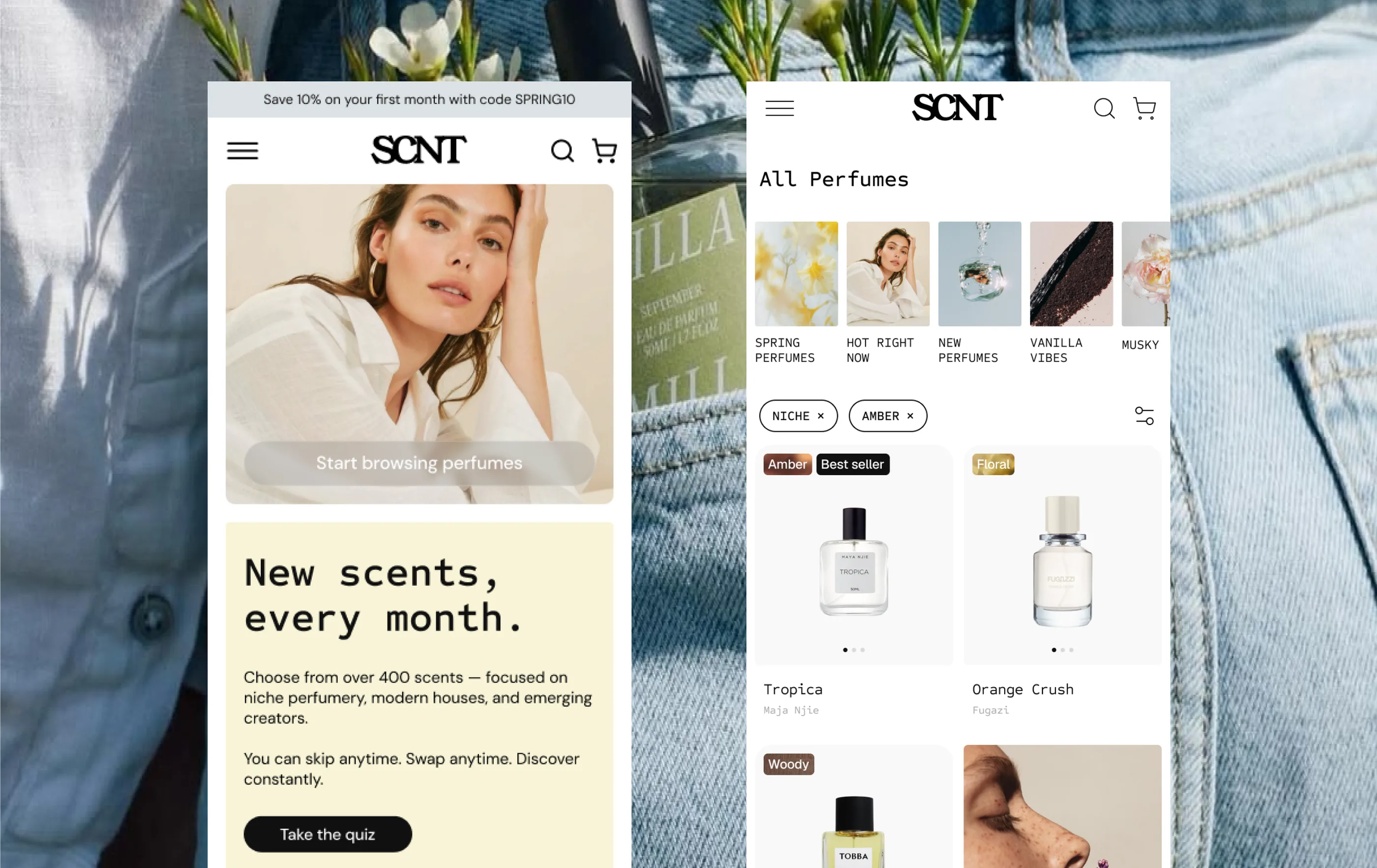
The homepage does two things: explain what SCNT is, and immediately make you want to explore. We led with a curation-based approach around featured scents, community picks, and the fragrance quiz. The subscription model is explained clearly and early, without a wall of text. Together the homepage guides first-time users as well as returning members into a guided exploration to find their first or next favorite scent.
The redesigned quiz is the entry point we introduced to solve a specific problem: most visitors don't know what they are looking for. Rather than dropping them into 400 scents and hoping for the best, we built a guided path that asks about mood, occasions, and preferences in plain language — no perfume knowledge required. The output is a personalized shortlist. It's the fastest path from undecided to finding the perfect fragrance, and one of the most direct levers for converting browsers into subscribers.
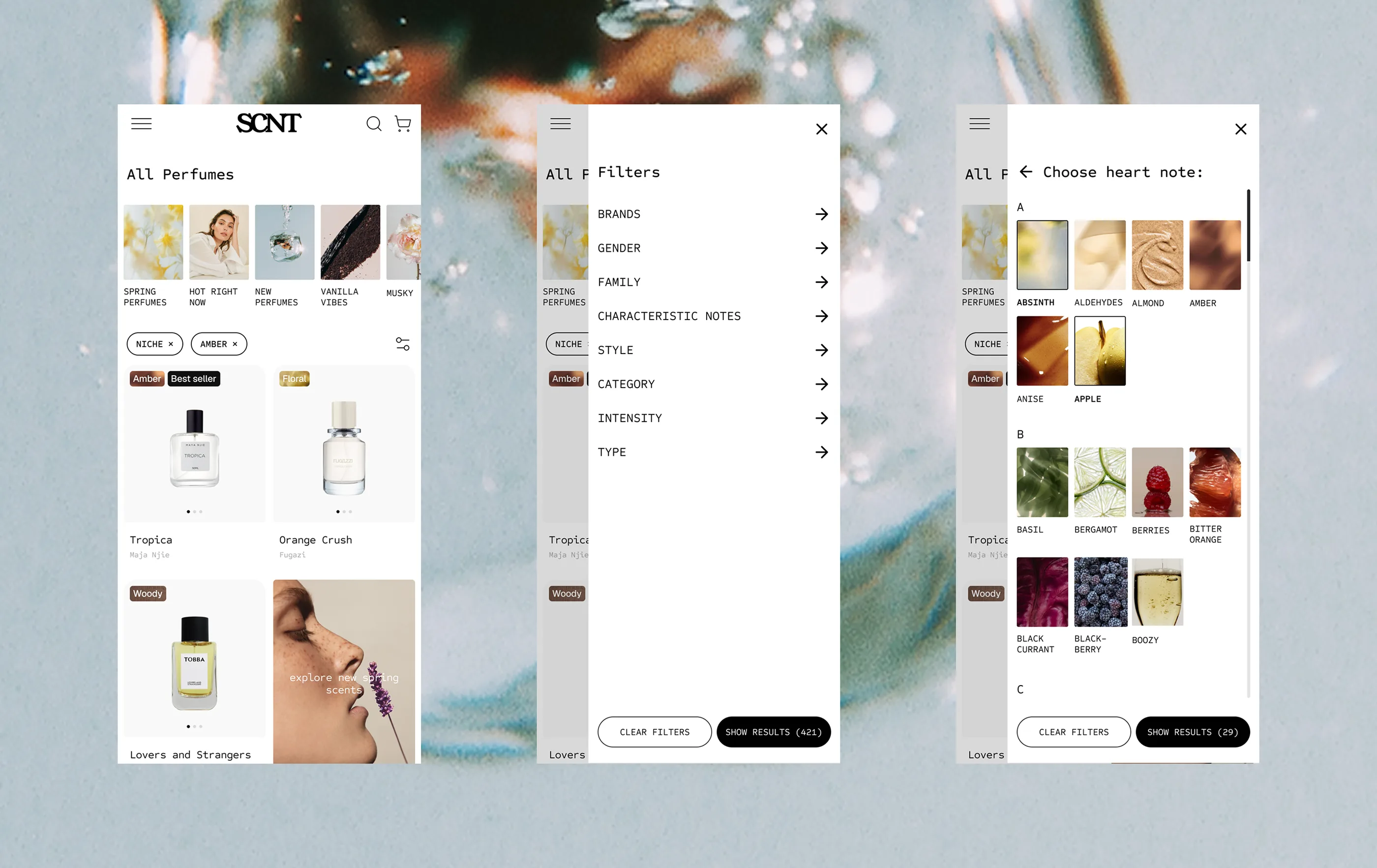
400+ scents is a lot to navigate. Without the right structure, it becomes paralysing and people leave without finding anything. We built more than a filter system — we designed a visual language for how fragrance can be explored. A way of cataloguing scents and notes that works the way fragrance lovers actually think: by house, by note profile, by mood, by concentration, by occasion. Each dimension of a scent gets its own visual identity within the system, so browsing feels like discovery rather than a search query. The niche and emerging houses that define SCNT's identity get editorial space within the grid. The aim: make exploration so intuitive and enjoyable that people go deeper, stay longer, and find their next favourite scent.


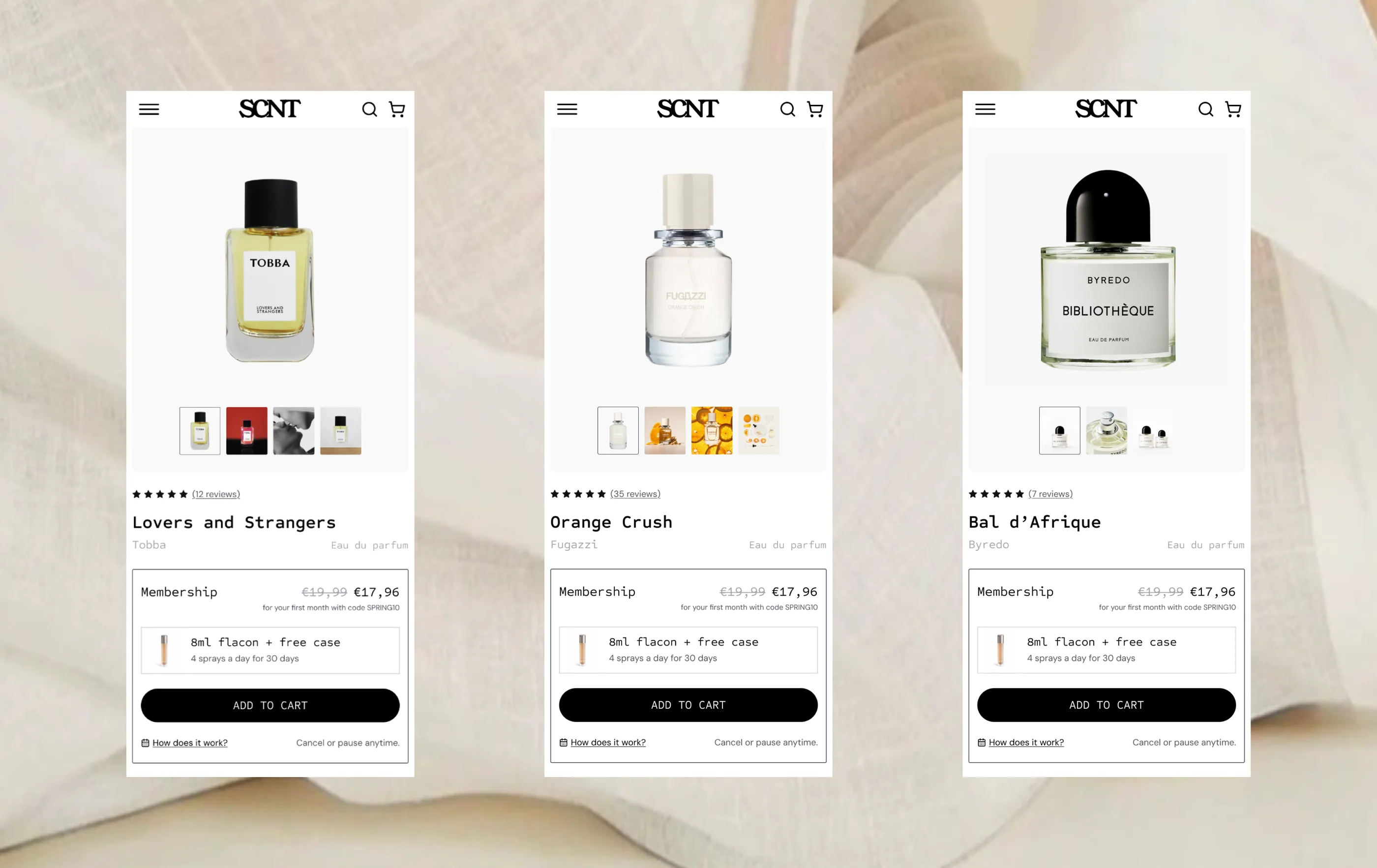
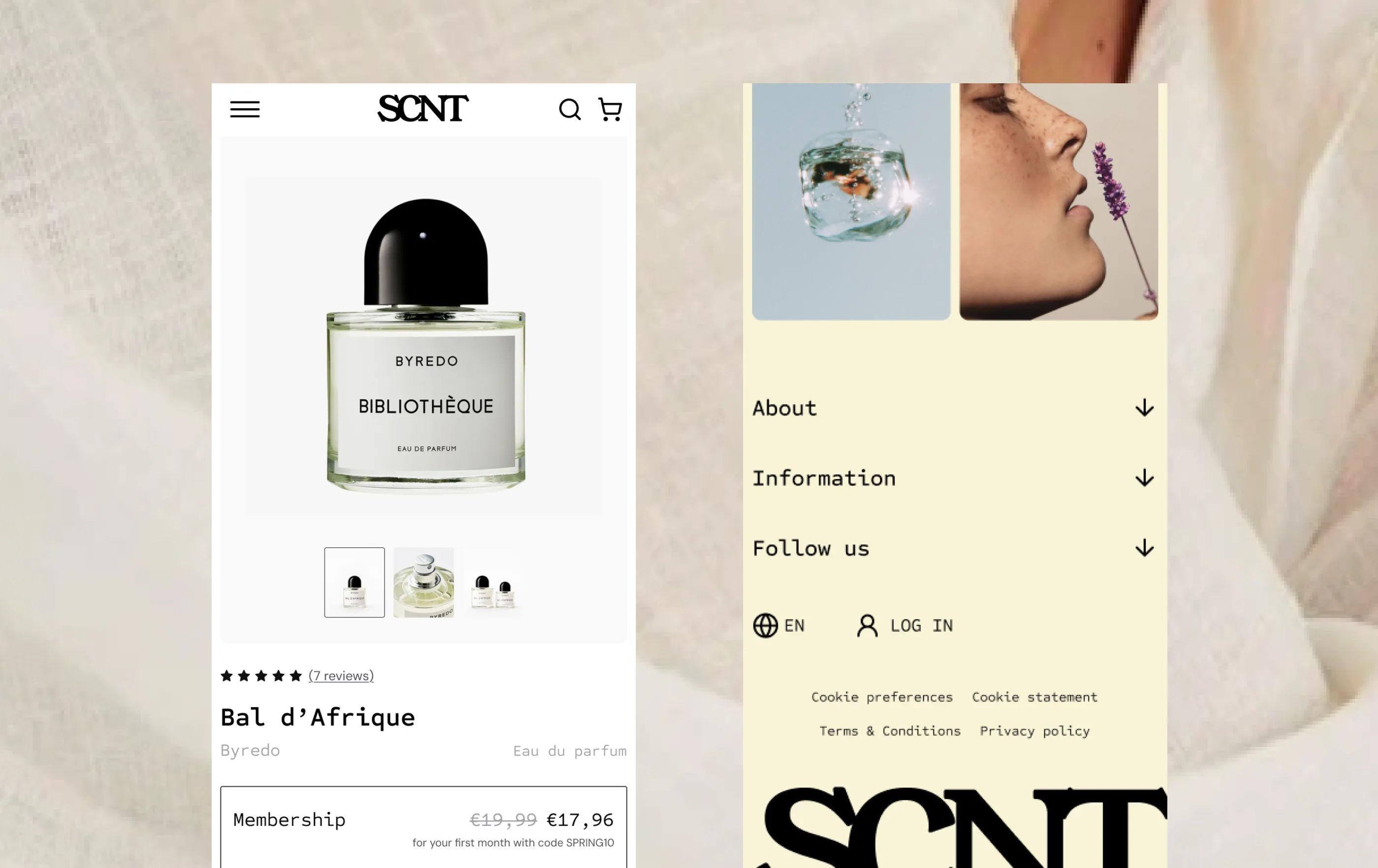
The product page has one job: help you decide. We structured it around the scent first — notes, house, description. The page reads fast whether you already know the fragrance or you're discovering it for the first time. The subscription mechanic is explained in context and compared to buying a full bottle. Deciding whether the fragrance is for you or not should be easy and fast.